It’s not just the pictures on the front of early postcards that can be fascinating. Flip them over and take a look at the logos on the back. The variety and style of logo design offer an interesting insight into the companies that published them.
Logo Design on Old Postcards
The first postcard publishers printed their names, or just their initials on their postcards to identify themselves. As more companies entered the postcard market, competition increased. Businesses needed to make the style or quality of their postcards stand out and trademarks representing such values began to appear.
Trademarks and what we now call ‘logos’ were a relatively new concept. In 1875, following landmark legislation, “a device, or mark, or name of an individual or firm printed in some particular and distinctive manner”[1] could be legally registered for the first time. It led to thousands of companies designing graphic devices to represent and protect their businesses.
New Technology
Postcards were also a new concept in late Victorian and Edwardian Britain. The industry took full advantage of new developments in photography and printing. Some of the new logos reflected these technological advances. The Living Picture Company, for instance, used an image of a camera.
The A & G Taylor logo is of a camera pointing at a globe. This is perhaps also a reference to the growth in international trade at the time.
Many publishers devised logos around their company names. Raphael Tuck & Son’s, Valentine & Son’s, and Bamforth & Co (see main picture above) are some examples of this.
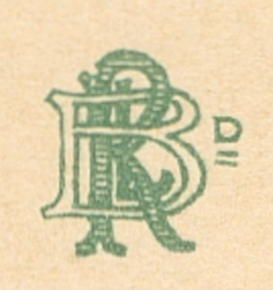
Others, such as The Photochrom Company, Gale & Polden and Brown & Rawcliffe used their company initials. They devised monograms, sometimes simple, some of them quite elaborate.
Classic Style
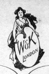
Wildt & Kray used a variety of logos based on their initials but also one featuring a classical figure holding what appears to be an artist’s paint board. Classical art, literature and design were hugely popular throughout the 19th and early 20th centuries so it is not surprising to see this referenced in postcard logo design.
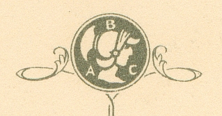
Wildt & Kray were not the only postcard publishers to adopt classical imagery. Other examples are The British Art Company logo featuring a centurion’s head and the Commercial Series logo from JW Bland which showed the god Hermes with his winged helmet and heels.
These were young companies operating in a brand new industry. Using classical iconography was a way to establish that they were respectable, reliable, and reputable businesses.
Heralding a New Era
Yet other postcard publishers took their inspiration from a different period of history. Medieval heraldry, as a means of identifying a person, family or lineage is itself considered an early example of branding.
This style was used by Alex Inglis, Blum & Degen, J A McCulloch & Co. and Jarrold & Son, and many others.
These companies designed coats of arms or heraldic icons to suggest the values of tradition, authority and strength reflecting confidence in their new businesses.
The most popular artistic styles of the age – Classical, Arts and Crafts, Art Nouveau, and Art Deco – are all reflected in logo design on old postcards. Next time you pick up an old postcard, flip it over and take a look.
Find out more
If this short look at postcard publishers and branding has sparked your interest, here are a few places you can find out more.
- The Commons:WikiProject Postcards is a growing archive of postcards and is particularly helpful in identifying publisher logos.
- Another fantastic website is MetroPostcard.com which also lists logos and has a handy guide to identifying postcard publishers from just their initials.
- Grace’s Guide has a huge amount of information about British companies in the past and is well worth a look.
Notes
[1] https://en.wikipedia.org/wiki/United_Kingdom_trade_mark_law

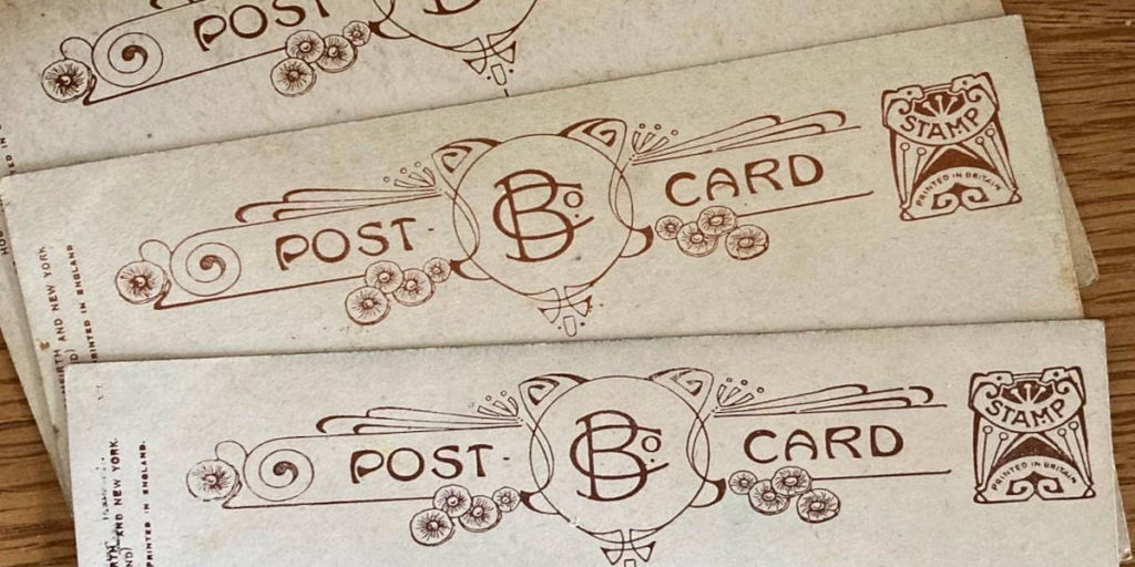

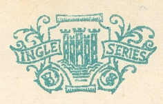

The Bamforth famous actress cards with the logo depicted in this series are a favorite series of mine.